FI101 - Charts
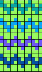
Charts for colour knitting come in many forms - look at the fair isle charts you have on hand.
When knitting Fair Isle IN THE ROUND, charts are read right to left, bottom to top.
When knitting Fair Isle back and forth, in flat pieces, you will follow your chart, bottom up, reading the right side rows from the right, and the "back side" rows from the left. (Note: If your piece is totally symmetrical, this actually won't matter....and you will be able to read the "back side" rows right to left if that makes more sense to you!)
Charts may have the stitch numbers and row numbers running along the bottom and up the side of the chart.
Here is the same simple chart - presented in 3 different formats.


personally, I prefer the bottom chart, then the top, and lastly, the middle. that said, the middle chart really makes you pay attention when you want to change some of the colors in a pattern. I still prefer the bottom chart, tho.
ReplyDelete